


Project Overview
Splash-n-Dash is the largest floating inflatable water park in North America, covering more than 200,000 square feet on Lake McSwain in California. The park has three main areas: Colossal Splash, which includes a 27-foot Giant Slide and a 33-foot Mega Blob; Big Splash, with over 35 attractions like the Relay Dash Trax; and Lil’ Splash, designed for young children. With huge towers, water slides, rock walls, and the well-known 150-foot Ali T. Gator inflatable, Splash-n-Dash is a top summer spot for families in Central California.
The old website struggled to turn visitors into guests. Important details were hidden in long FAQ pages, the design didn’t showcase the park’s energy or scale, and booking on a phone was difficult. We redesigned the site to fix these problems by using lively visuals and organizing information more clearly. Now, guests can quickly find what they need, and the mobile site is easy for families to use, even when they’re planning their day or on the way to the lake.
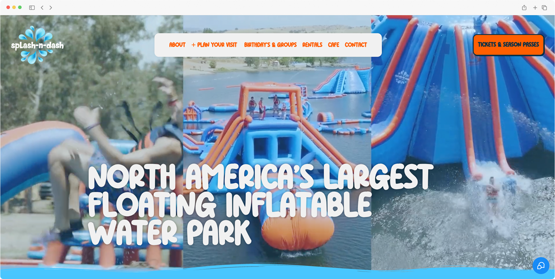
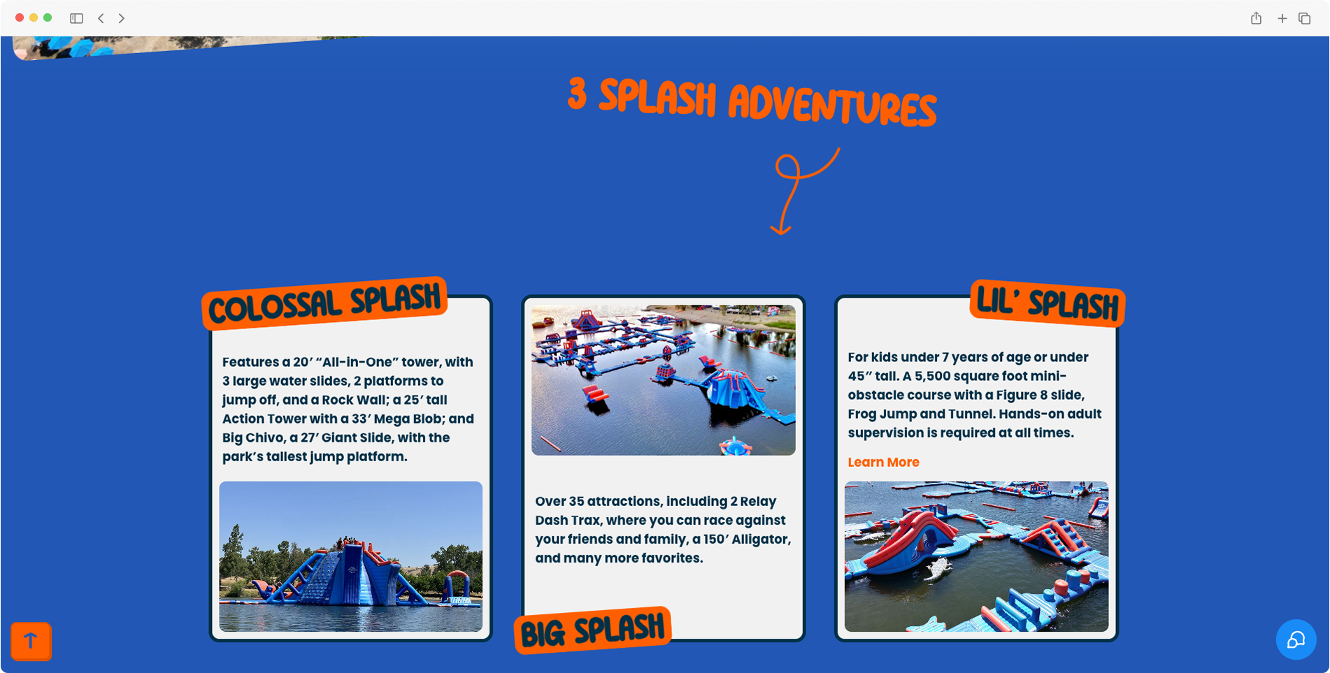
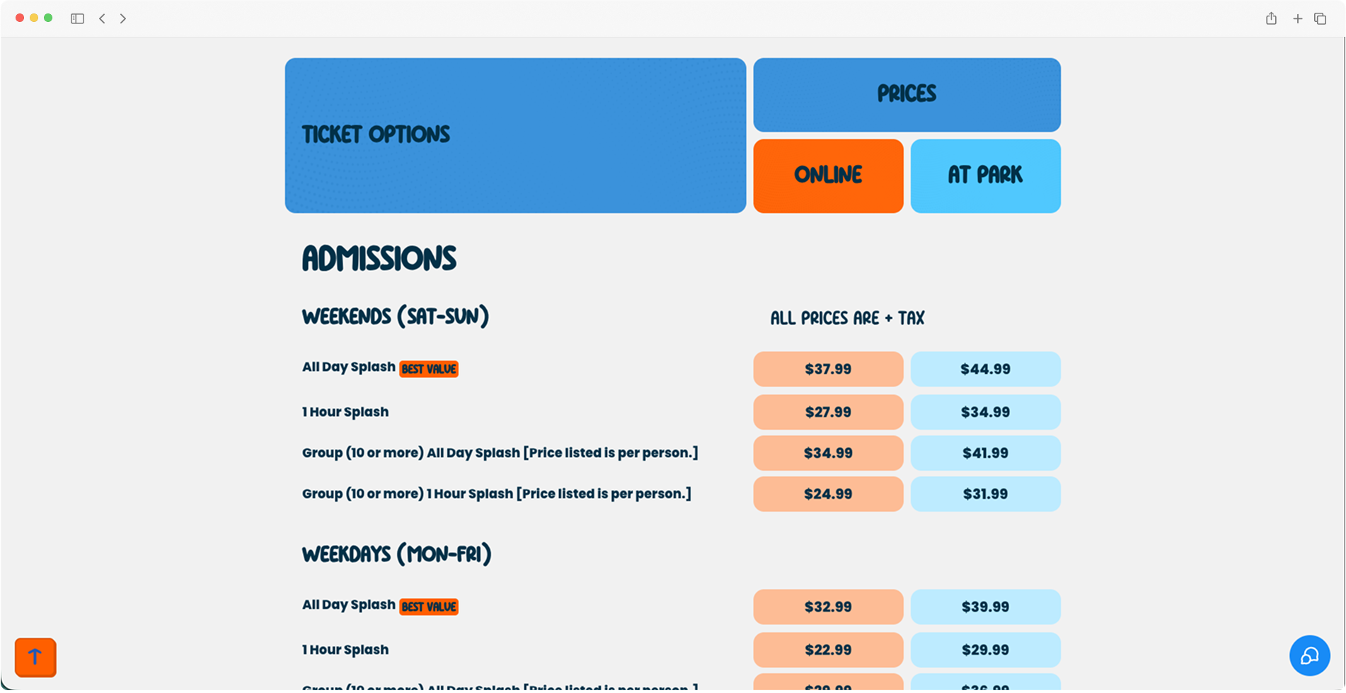
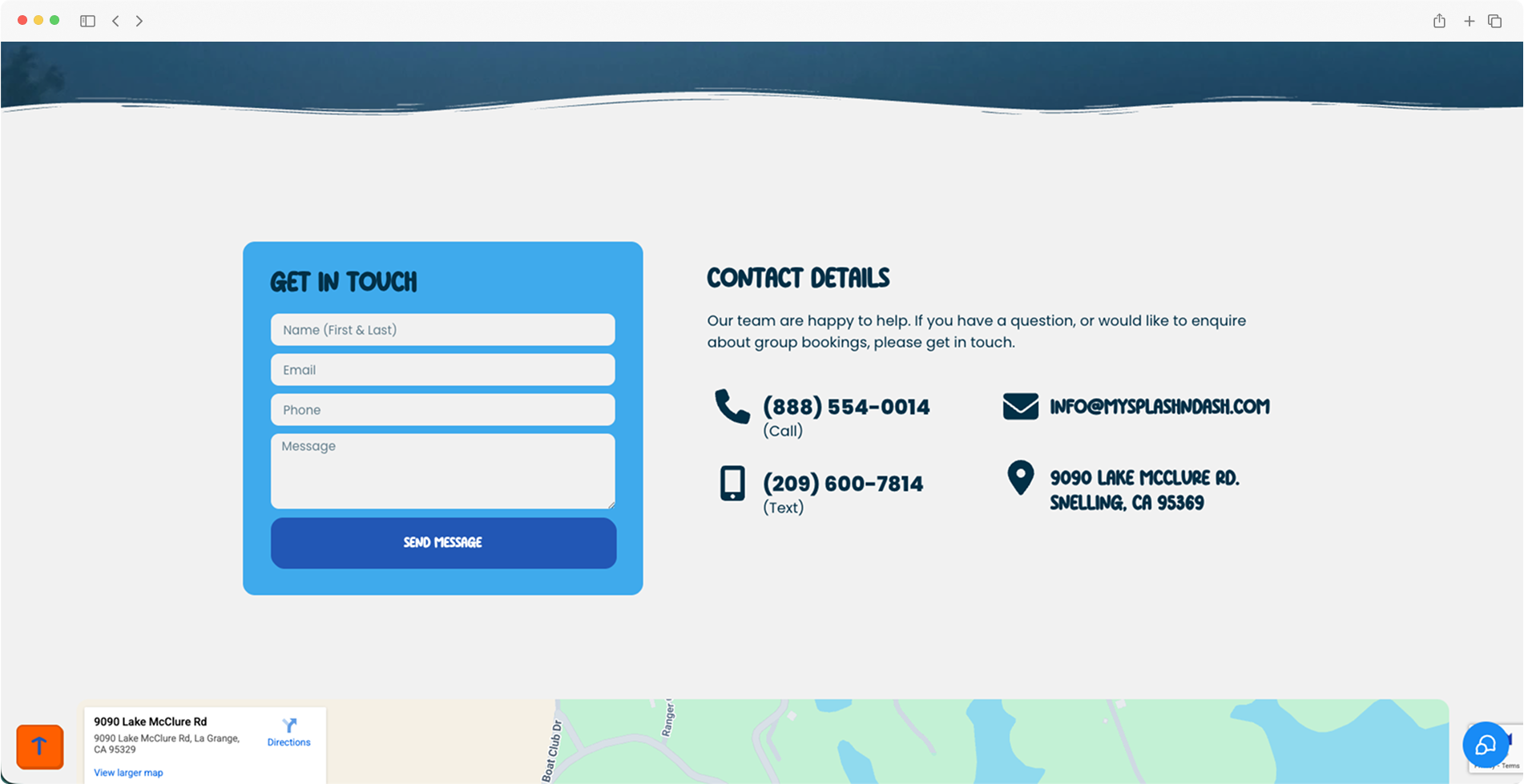
Website Design
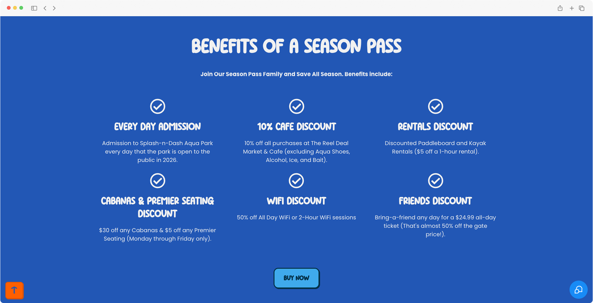
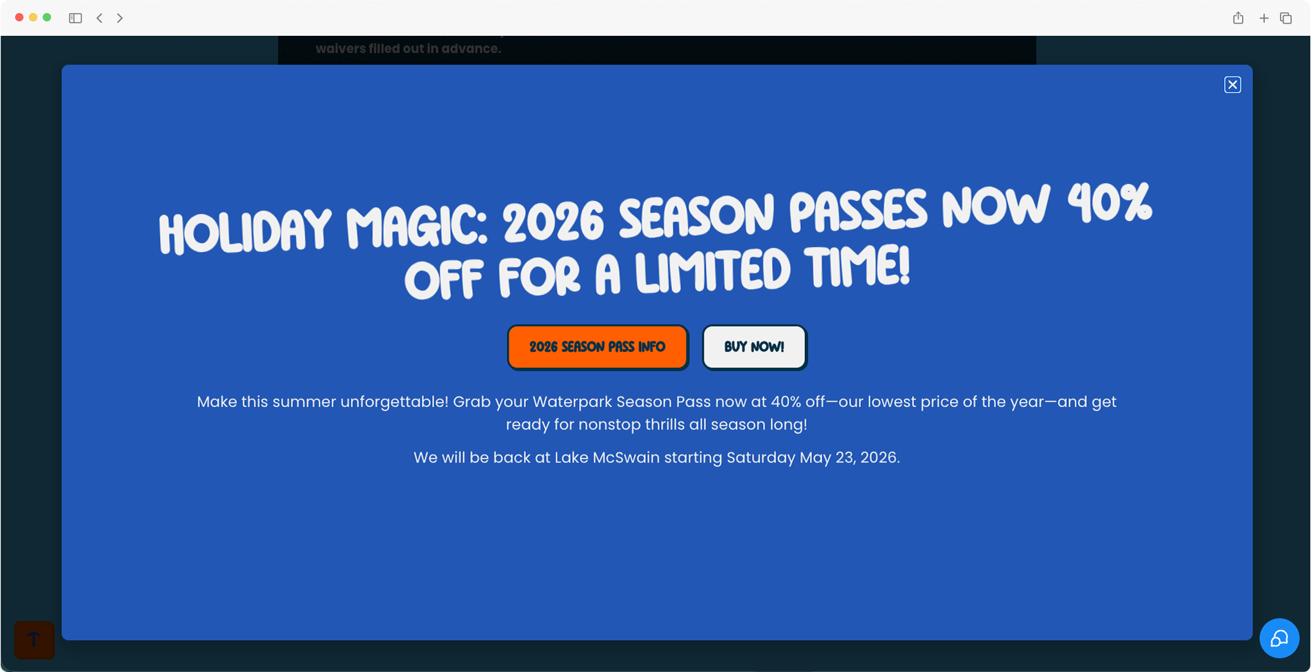
The LandzEdge website captures the excitement of arriving at the park. Its clean, modern design prioritizes easy navigation and features photography of guests enjoying the inflatable obstacle course. Large hero images immediately convey the fun and adventure available. The design balances visual excitement with functional simplicity, ensuring families can quickly find information and proceed seamlessly to booking.
Mobile Friendly
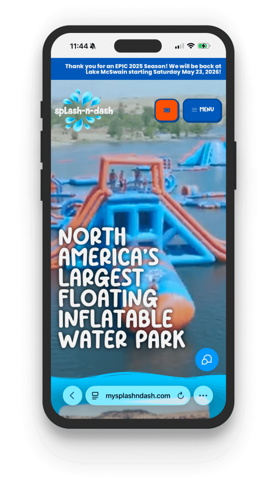
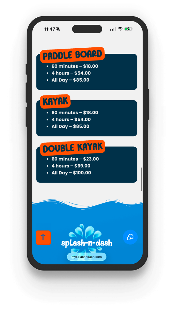
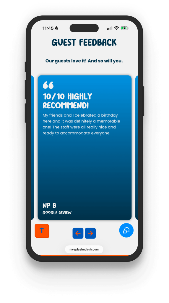
Since most people visit the site on their phones, the mobile design focuses on speed and ease of use. Big, easy-to-tap buttons make booking simple, even in bright sunlight or with wet hands. Important details like hours, directions, prices, and safety rules are just two taps away. Ticket choices are shown on clear cards that make it easy to compare options without crowding the screen, and photos look great on any device.
Improved Information & Layout
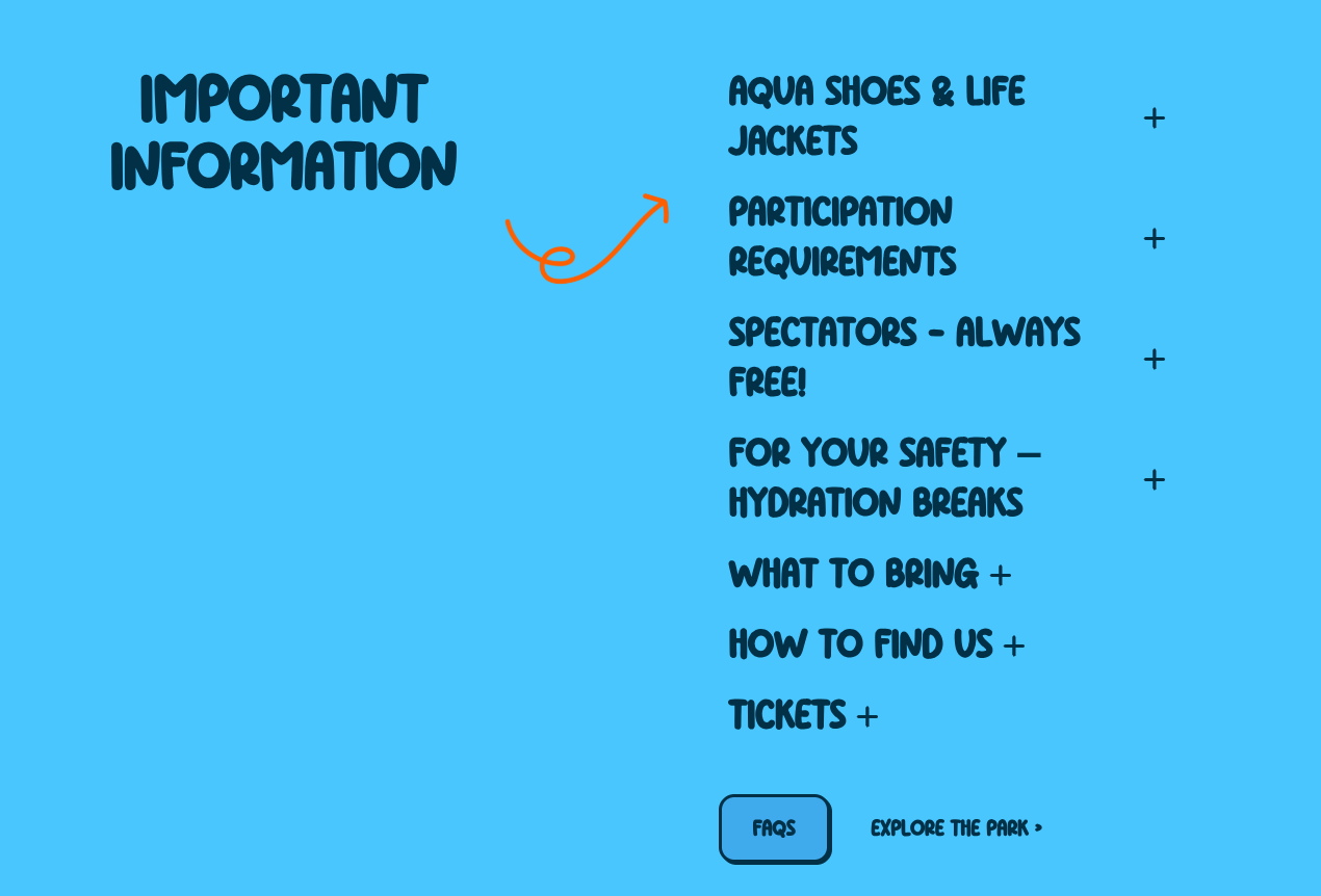
The old site hid important visitor info in long FAQ sections, making it hard for guests to find basics like height limits or what to bring. We fixed this by creating a clear “Know Before You Go” page that makes all pre-visit details easy to spot with icons and short text. Prices and ticket choices are now shown side by side, so guests can compare right away. Group and birthday party details have their own section, so they’re not lost in the FAQs. Now, visitors get answers faster, staff answer fewer questions, and families come better prepared for their day at the lake.